Opera Lafayette: Redesigning a cultural website to drive ticket sales.
Opera Lafayette: Redesigning a cultural website to drive ticket sales.
Opera Lafayette: Redesigning a cultural website to drive ticket sales.
Service
UI/UX Design
UI/UX Design
Client
Opera Lafayette, USA
What I Do
Website Re-design
Website Re-design

01 Branding
02 Website Design
03 Figma
04 Opera Lafayette
05 Design System
01 Branding
02 Website Design
03 Figma
04 Opera Lafayette
05 Design System
About this project
About this project
About this project
Opera Lafayette wanted to modernize their website to improve ticket sales and make their rich performances easier to explore. The old website had scattered information, outdated design elements, and a confusing ticket-buying flow.
Opera Lafayette wanted to modernize their website to improve ticket sales and make their rich performances easier to explore. The old website had scattered information, outdated design elements, and a confusing ticket-buying flow.
A Washington D.C. opera company needed their digital presence to match the quality of their performances. I redesigned the end-to-end experience — from show discovery to checkout — and the results were immediate.
A Washington D.C. opera company needed their digital presence to match the quality of their performances. I redesigned the end-to-end experience — from show discovery to checkout — and the results were immediate.
Problem
Opera Lafayette is a respected cultural institution based in Washington D.C. — but their website was undermining their brand and costing them revenue. The navigation was buried, performance information was scattered across multiple pages, and the ticket-buying flow required too many steps for most users to complete.
Opera Lafayette is a respected cultural institution based in Washington D.C. — but their website was undermining their brand and costing them revenue. The navigation was buried, performance information was scattered across multiple pages, and the ticket-buying flow required too many steps for most users to complete.
For an organisation that depends on ticket sales to fund its mission, this was a critical business problem — not just a design one.
For an organisation that depends on ticket sales to fund its mission, this was a critical business problem — not just a design one.
Solution
I designed a fresh digital experience that reflects Opera Lafayette’s rich cultural legacy — while making it easy for users to browse shows, buy tickets, and learn more about the organization.
I designed a fresh digital experience that reflects Opera Lafayette’s rich cultural legacy — while making it easy for users to browse shows, buy tickets, and learn more about the organization.
Team
Client
Me
My role
Solo UX/UI Designer
Timeline
2 week
Tools
Figma, Notion

Design Process
Design Process
Research & Strategy
Rsearch
User Flow
Competitor
Information Architecture
Design & Branding
Branding
Wireframing
Design System
Visual Design
Delivery Execution
Prototype
Testing
Development
Finalization
Research & Discovery
Research & Discovery
I started with a full audit of the existing site, mapping the user journey from homepage to checkout. I then benchmarked against The Met Opera, the Royal Opera House, and Broadway.com to identify what high-performing cultural sites do differently.
I started with a full audit of the existing site, mapping the user journey from homepage to checkout. I then benchmarked against The Met Opera, the Royal Opera House, and Broadway.com to identify what high-performing cultural sites do differently.
I started with a full audit of the existing site, mapping the user journey from homepage to checkout. I then benchmarked against The Met Opera, the Royal Opera House, and Broadway.com to identify what high-performing cultural sites do differently.
Five critical insights shaped the entire redesign:
Five critical insights shaped the entire redesign:
Five critical insights shaped the entire redesign:
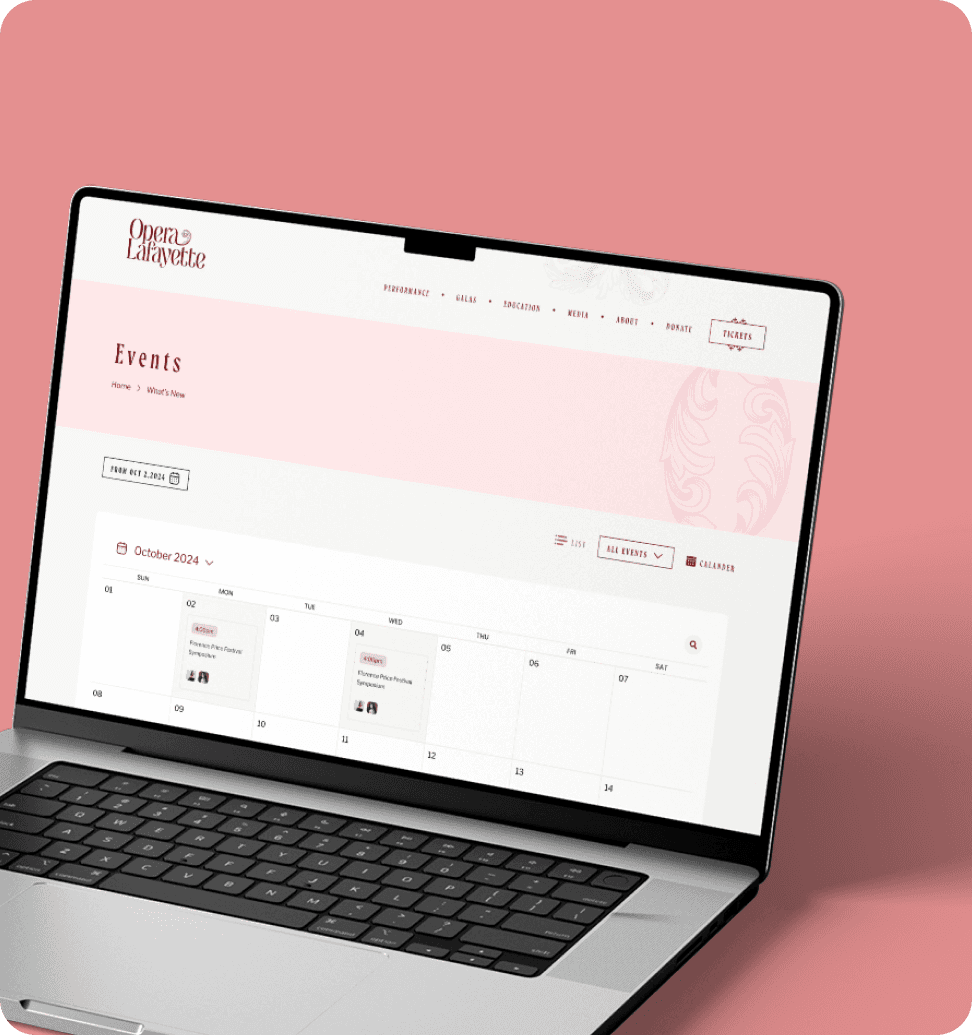
60% of users visited only the performance pages — show discovery was the #1 job, and it was broken
Users couldn't find the season calendar without clicking through 4+ pages
Ticket CTAs were buried mid-page — users had to scroll to find them
Event pages had no video, no cast info, no press reviews — nothing to build the emotional desire to attend
The mobile experience was effectively unusable, despite 35% of traffic coming from phonesuild emotional desire
Mobile experience was broken — 35% of traffic came from phones
Key Design Decisions
Key Design Decisions
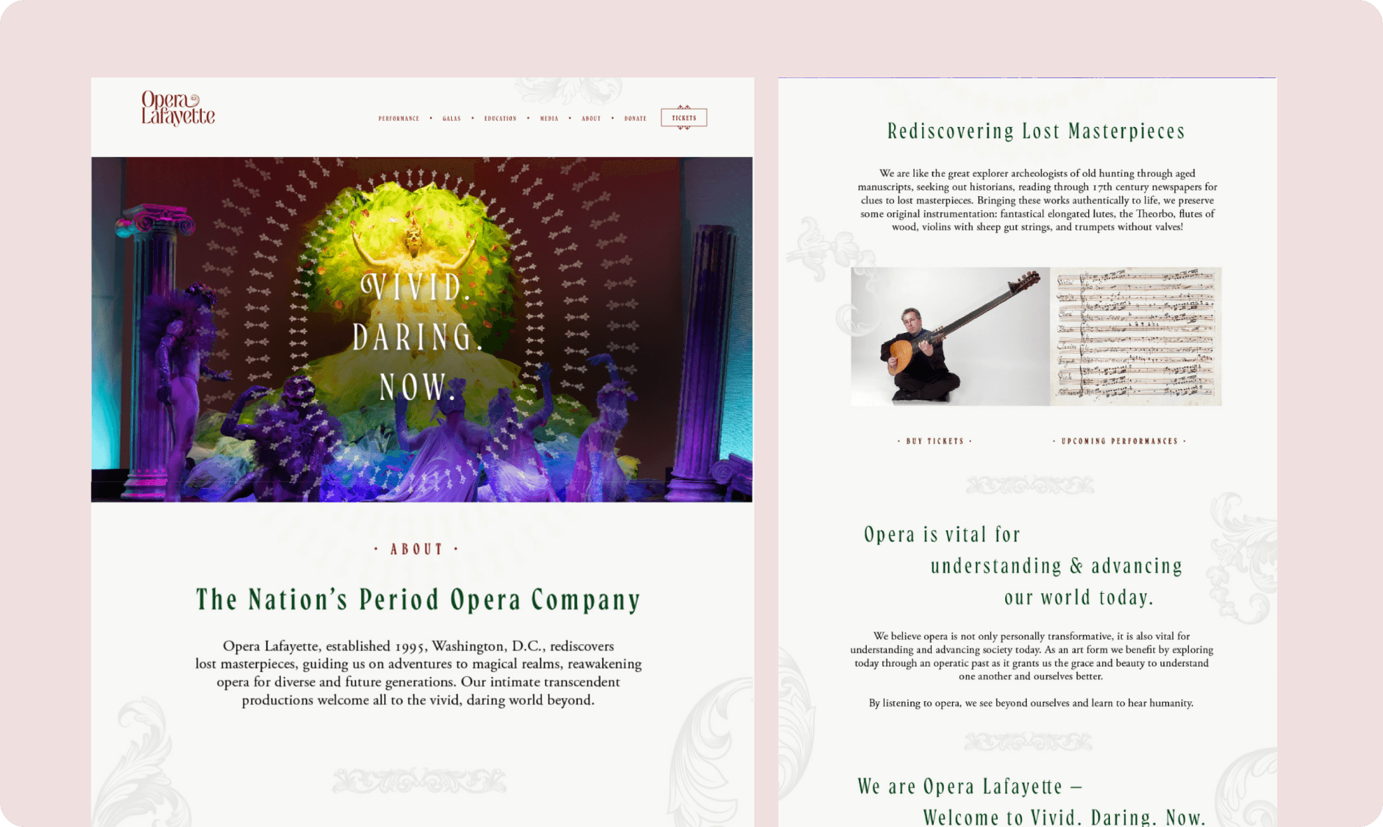
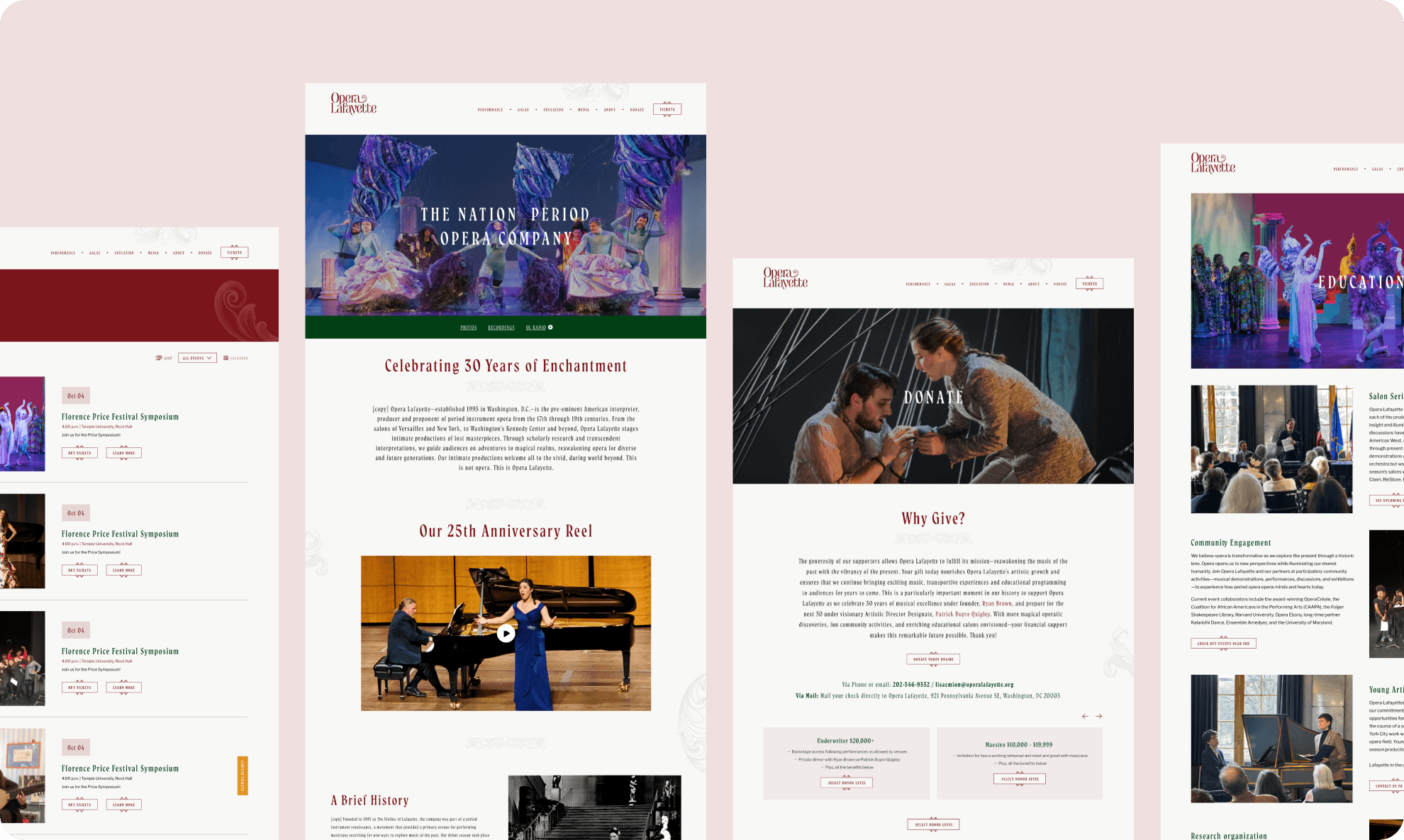
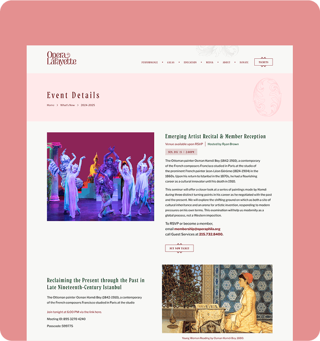
Homepage: Show discovery front and centre
Homepage: Show discovery front and centre
I moved the current season and upcoming performances into the hero section — the first thing every visitor sees. Show cards display the title, date, venue, and a "Buy Tickets" button in a single glance. No more hunting.
I moved the current season and upcoming performances into the hero section — the first thing every visitor sees. Show cards display the title, date, venue, and a "Buy Tickets" button in a single glance. No more hunting.
Rebuilt performance pages
Rebuilt performance pages
Each performance page was rebuilt with a trailer embed, cast biographies, pull quotes from press reviews, and a historical background section for new audiences. The insight: theater audiences are emotionally driven.
Each performance page was rebuilt with a trailer embed, cast biographies, pull quotes from press reviews, and a historical background section for new audiences. The insight: theater audiences are emotionally driven.
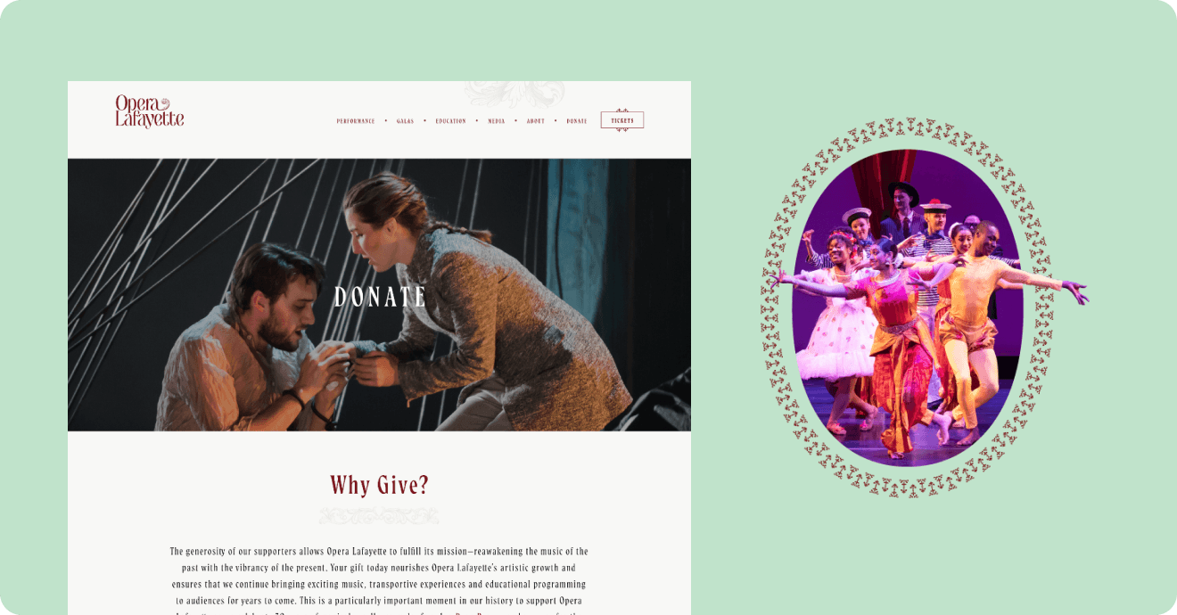
Sticky "Buy Tickets" CTA
Sticky "Buy Tickets" CTA
The ticket call-to-action now follows the user as they scroll through every show page. This single change was the single biggest driver of the conversion improvement.
The ticket call-to-action now follows the user as they scroll through every show page. This single change was the single biggest driver of the conversion improvement.
Simplified navigation
Simplified navigation
I collapsed "Performances / Events / Tickets / Schedule" into one clean navigation structure. Users now reach their destination in 2 clicks instead of 5.
I collapsed "Performances / Events / Tickets / Schedule" into one clean navigation structure. Users now reach their destination in 2 clicks instead of 5.
Mobile-first rebuild
Mobile-first rebuild
All layouts were rebuilt for mobile: large touch targets, vertical card layouts, and a checkout flow that works one-handed.
All layouts were rebuilt for mobile: large touch targets, vertical card layouts, and a checkout flow that works one-handed.
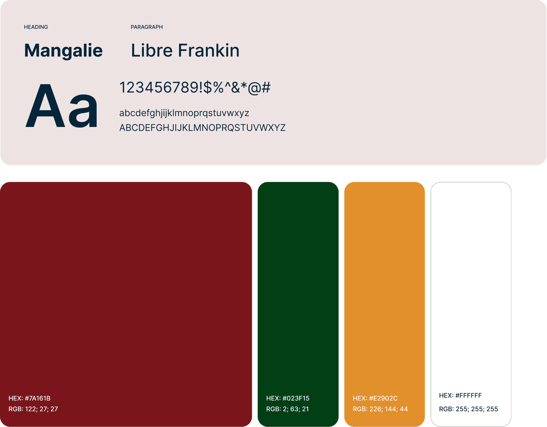
Style Guide
Style Guide
A UI combines soft, calming color palettes with modern typography to create a welcoming atmosphere.
A UI combines soft, calming color palettes with modern typography to create a welcoming atmosphere.
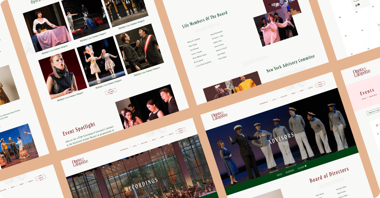
Final Solutions
Final Solutions
Final Solutions
Final Design
Final Design
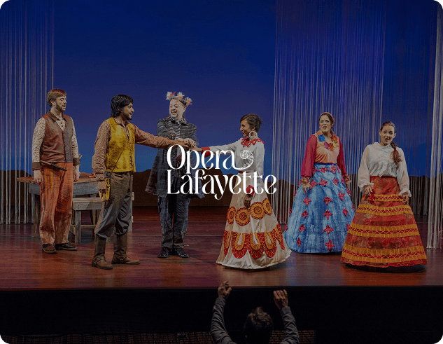
To preserve the legacy of Opera Lafayette, we refined — not rebranded — their identity.
The final site balances clarity and sophistication, with immersive visuals, refined typography, and a performance-focused layout that invites users to engage deeply.
To preserve the legacy of Opera Lafayette, we refined — not rebranded — their identity.
The final site balances clarity and sophistication, with immersive visuals, refined typography, and a performance-focused layout that invites users to engage deeply.
To preserve the legacy of Opera Lafayette, we refined — not rebranded — their identity.
The final site balances clarity and sophistication, with immersive visuals, refined typography, and a performance-focused layout that invites users to engage deeply.
Re-Design Outcomes
Re-Design Outcomes
This wasn’t just a redesign — it was a digital transformation. Opera Lafayette’s online presence now echoes the beauty and nuance of their performances. It bridges generations, inviting both loyal patrons and new audiences into an immersive cultural journey.
This wasn’t just a redesign — it was a digital transformation. Opera Lafayette’s online presence now echoes the beauty and nuance of their performances. It bridges generations, inviting both loyal patrons and new audiences into an immersive cultural journey.
18%
Increase in ticket booking completion
24%
Improvement in user engagement
30%
Faster Improved navigation